A Better Job Form and a Friendlier Tone
The job posting form just got a major upgrade, and the site dropped the swearing. Here is what changed and why.
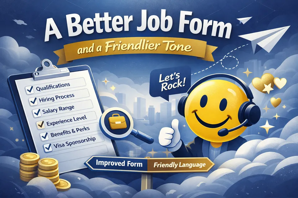
Two things happened this week. The job posting form got substantially better, and the site's language got substantially less aggressive. Both changes came from the same place: I want more employers to feel comfortable posting here.
The form
When I first built the job form, it covered the basics. Title, description, company, salary, location. Enough to get a listing live. But the more I looked at real job postings, the more I realised the form was leaving useful information on the table.
Here is what is new.
Qualifications
There is now a dedicated qualifications section with a rich text editor. Previously, employers would bury requirements somewhere in the description. That made it harder for candidates to find what mattered, and harder for me to present listings consistently. Now qualifications have their own space, separate from the job description.
Hiring process
Same idea. The hiring process field has been upgraded to a rich text editor. If your process has multiple stages, you can format them clearly with bullet points or numbered steps instead of cramming everything into a single text box.
This one matters more than people think. Some developers actively seek out roles with take-home exercises or live coding challenges. Others will skip a listing entirely if it mentions a LeetCode-style test. Neither group is wrong, but both want to know up front. Being transparent about your process helps employers attract candidates who are genuinely comfortable with how they hire, and helps candidates avoid wasting time on a process that is not right for them.
Salary range
Salary is now a proper min/max range instead of a single number. Most roles have a band. The form now reflects that. If there is no range, just enter the minimum salary and leave the max field blank. Only the minimum is required.
Experience level
A new dropdown for experience level. Intern, apprentice, junior, mid, senior, staff, principal, director, C-suite, partner, co-founder. It is optional, but when it is there, candidates can immediately see whether a role is right for them.
Benefits and perks
A set of checkboxes for common benefits: health insurance, remote friendly, flexible hours, equity, learning budget, generous PTO, retirement plan, relocation assistance, and a few more. Quick to fill in, useful for candidates scanning multiple listings.
Visa sponsorship
This gets its own section now. One checkbox: "This role offers visa sponsorship." Simple, visible, and important for a significant number of candidates.
Section navigation
The form has ten sections. That is a lot of scrolling. So I added a sticky sidebar that shows every section and highlights the one you are currently viewing. Click any section to jump straight to it. The sidebar only appears on larger screens and stays out of your way on mobile.
This also solves a discoverability problem. Some employers were writing qualifications into the description field without realising there was a dedicated qualifications section further down. The sidebar makes the full structure visible from the moment the page loads.
Legal terms
A small but important addition: a legal disclaimer at the bottom of the form, before the submit button. It confirms that you have the authority to post on behalf of the company, that the information is accurate, and that spam and offensive content will be removed. It links to the Terms of Service and Privacy Policy (both open in new tabs so you do not lose your draft). And if a paid listing is rejected, you get a full refund.
The tone
Forcepull launched with a lot of swearing. The tagline was "No bullshit." The hero said it, the footer said it, the job form said it, the about page said it. I thought it was funny and honest and would make the site stand out.
It did stand out. But as I started reaching out to employers, I realised the tone was putting some of them off. Not everyone, but enough. A hiring manager at a large company does not want to paste a link into Slack that says "no bullshit" on it. A recruiter at a conservative firm does not want that on their screen during a meeting. The language was filtering out exactly the kind of employers I wanted to attract.
So I removed it. All of it. The hero now reads "Your next role is closer than you think." The footer says "High-signal job boards." The form says "Let's rock." The values are the same. No tracking, no upsells, no pay-to-rank, no data harvesting. I just stopped swearing about it.
I am not embarrassed about the original tone. It was genuine and it reflected how I felt at the time. But a job board exists to connect employers and candidates, and anything that gets in the way of that is not doing its job. The swearing was getting in the way.
What is next
The form is in a good place now. There are a few more things I want to add, like better tag suggestions and smarter defaults for returning employers, but the core experience is solid. If you have not posted a job yet, give it a go. The launch offer is still running: every listing is free until May 31st.
And if you tried the old form and found it lacking, come back and try this one. I think you will notice the difference.